Mobile-First Approach
We design websites that adapt seamlessly to all screen sizes, ensuring a smooth user experience on mobiles, tablets, and desktops.
Loading
Our strong passion to modern tech trends and best practices drive in the development of top-notch solutions that are perfectly tailored to provide high quality and affordable software outsourcing solutions to growing startup and enterprise companies in the world.


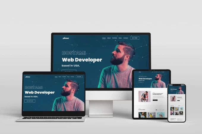
In today’s digital world, a responsive website is essential for businesses looking to provide a seamless user experience across all devices. Whether your visitors are browsing on a desktop, tablet, or smartphone, our responsive web design ensures that your website adapts flawlessly to any screen size.

We design websites that adapt seamlessly to all screen sizes, ensuring a smooth user experience on mobiles, tablets, and desktops.

Our responsive designs load quickly, look modern, and keep users engaged across every device.
Deliver a seamless experience across all devices.
Improve navigation and accessibility for your audience.
Boost search engine rankings with Google’s mobile-first indexing.
Optimize performance for quick page load times.
Enhance engagement and increase leads or sales.
Keep your website updated and secure.